


 Posts
Posts


Monday, 13 September 2010
So, in the final "Website Inspiration" showcase, I've included some sites about coffee. Coz coffee smells nice and stuff.
1. Pura Vida.
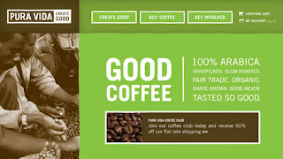
2. Seattle's Best Coffee.

3. Henrici.

4. Sweet Sallie's.

5. Cilantro's.

6. Kicking Horse Coffee.

7. Robust-ah.

8. 1369 Coffee House.

9. Park Avenue Coffee.

10. Greyhouse Coffee.

11. Dunn Bros. Coffee.

12. Looney Bean Coffee.

13. Bean Exchange.

14. Java Cabana.

15. Cuvee Coffee.

16. Cafe Britt.

17. Starbucks Coffee At Home.

18. Cafe Theatre de la Marionette.

19. Copper Door Coffee Roasters.

20. Melitta, USA.

Read more »
1. Pura Vida.

2. Seattle's Best Coffee.

3. Henrici.

4. Sweet Sallie's.

5. Cilantro's.

6. Kicking Horse Coffee.

7. Robust-ah.

8. 1369 Coffee House.

9. Park Avenue Coffee.

10. Greyhouse Coffee.

11. Dunn Bros. Coffee.

12. Looney Bean Coffee.

13. Bean Exchange.

14. Java Cabana.

15. Cuvee Coffee.

16. Cafe Britt.

17. Starbucks Coffee At Home.

18. Cafe Theatre de la Marionette.

19. Copper Door Coffee Roasters.

20. Melitta, USA.

Below are four commercial websites that I was pretty impressed with. The thing that all 4 of them have in common is the clear navigation and beautiful design. I believe the design is beautiful because the corporate identity is very apparent in each site.
1. Rohm and Haas.

2. conEdison.

3. McDonald's.

4. Levi's Strauss.

Read more »
1. Rohm and Haas.

2. conEdison.

3. McDonald's.

4. Levi's Strauss.

Below is a roundup of some beautiful website design, although they are not all "coffee" websites, they are still an inspiration, methinks.
1. Corvus Design.

2. Oddo Design.

3. Rocket Club.

4. Edgepoint Church.

Read more »
1. Corvus Design.

2. Oddo Design.

3. Rocket Club.

4. Edgepoint Church.

Saturday, 24 July 2010
For one of our Typography for Digital Media projects, we have to make a weather report in motion. Kinda thing. Like faux motion graphics. But using Flash.
Anyway, I am seriously having trouble trying to storyboard that shit, so I looked at some references on YouTube. I know it's not exactly what we're trying to achieve, but inspiration nonetheless.
1. Pulp Fiction in Motion Graphics:
2. Pulp Fiction Kinetic Typography
3. The 8 Rules of Fight Club
4. Tropic Thunder Kinetic Typography
5. Stewie Griffin - Kynetic Type
6. Minimalism Kinetic Type Poem
7. You're Stupid
8. Social Life, With Friends
9. Fight Club Chemical Burn
10. Superbad Typography
Read more »
Anyway, I am seriously having trouble trying to storyboard that shit, so I looked at some references on YouTube. I know it's not exactly what we're trying to achieve, but inspiration nonetheless.
1. Pulp Fiction in Motion Graphics:
2. Pulp Fiction Kinetic Typography
3. The 8 Rules of Fight Club
4. Tropic Thunder Kinetic Typography
5. Stewie Griffin - Kynetic Type
6. Minimalism Kinetic Type Poem
7. You're Stupid
8. Social Life, With Friends
9. Fight Club Chemical Burn
10. Superbad Typography
Wednesday, 30 June 2010
On the Web Design 1 front, there have been a few "drastic" changes made to my project. I don't know if I can call them improvements, so I guess I'll just call them changes.
Anyway, I won't write a long long post detailing all the said changes, so don't redirect away from this page.
I will, however, mention that I've decided to try out a horizontal scrolling layout. So this is just a little post to share a few websites I found interesting.
1. Carrot Creative

I first found out about this company from a designer, whose blog I follow. Although it's simple, I really like how they've played with the space here.
2. Dean Oakley - Freelance web design, Gold Coast, Brisbane

No doubt the art on this portfolio is very good, but another thing I thought was good about this particular site was the navigation.
There are sites that neglect to include a clear navigation bar that is present on every section, making the user scroll endlessly back and forth to get to the content they want. This earns negative points for the user experience, I think.
3. Hasrimy.com - A professional freelance web designer

I believe this site is worth a mention because it has appeared on many "great horizontal scrolling design" lists that I've looked at. Another thing that makes it mention-worthy is the fact that it is a Malaysian site. In my opinion, the user experience is not bad, however, I think I would have liked it more if there was a fixed navigation bar. Although they do include navigation at the top of every section, I still feel a fixed one would be awesome.
4. Eric Johansson - Portfolio

His tagline is "This site is a drag". And it is a drag, literally. Because you drag using the little scroll bar at the bottom. Yeah, anyway, it's interesting and I guess since it's a portfolio with less content, this approach is pretty cool.
5. Glasshouse

Yeah, so I saved the "best" for last. As we know, "best" is relative, but I really like this site here. The graphics are great and the scrolling is very comfortable. And the overall design gels very well.
That is all for this post, I believe.
Read more »
Anyway, I won't write a long long post detailing all the said changes, so don't redirect away from this page.
I will, however, mention that I've decided to try out a horizontal scrolling layout. So this is just a little post to share a few websites I found interesting.
1. Carrot Creative

I first found out about this company from a designer, whose blog I follow. Although it's simple, I really like how they've played with the space here.
2. Dean Oakley - Freelance web design, Gold Coast, Brisbane

No doubt the art on this portfolio is very good, but another thing I thought was good about this particular site was the navigation.
There are sites that neglect to include a clear navigation bar that is present on every section, making the user scroll endlessly back and forth to get to the content they want. This earns negative points for the user experience, I think.
3. Hasrimy.com - A professional freelance web designer

I believe this site is worth a mention because it has appeared on many "great horizontal scrolling design" lists that I've looked at. Another thing that makes it mention-worthy is the fact that it is a Malaysian site. In my opinion, the user experience is not bad, however, I think I would have liked it more if there was a fixed navigation bar. Although they do include navigation at the top of every section, I still feel a fixed one would be awesome.
4. Eric Johansson - Portfolio

His tagline is "This site is a drag". And it is a drag, literally. Because you drag using the little scroll bar at the bottom. Yeah, anyway, it's interesting and I guess since it's a portfolio with less content, this approach is pretty cool.
5. Glasshouse

Yeah, so I saved the "best" for last. As we know, "best" is relative, but I really like this site here. The graphics are great and the scrolling is very comfortable. And the overall design gels very well.
That is all for this post, I believe.
Sunday, 25 October 2009
Wah lau! I need to stop over-thinking things when I sample a colour palette. I keep worrying that I am choosing the wrong colour, even though I'm supposed to choose the colours that appeal to me.


.jpg)


Read more »
Anyway, below are some colour palettes that I think can inspire me when doing my mobile and screen interfaces. I found pictures with the keyword "happy", so don't laugh at the pictures, ok!
~~~
First Palette!


This palette is called "Happy and Strange". I named it after the picture that inspired it.
Image is courtesy of =ThePockyMonster on DeviantArt. This is actually my favourite palette from the three that I will post on here, mainly because I like the colour scheme, it makes me feel floaty. Very interesting. Haha!
~~~
Second Palette!
.jpg)

Again, I have named the palette after the image that inspired it. It's called "Happy Chicken". The last colour is white, I should have put a border round the palette because it doesn't show up on my blog because of the white background. *sad face*
Anyway, yes, image is courtesy of =vaporotem on DeviantArt!
~~~
Third Palette!


Ok. I really like the art piece, but the palette is weird. I guess there were just too many colours in the oil painting, I just chose a little bit of it and sampled colours from that. Not too happy with this one, but I reckon it will look very nice against white.
Palette is called "Happy Street". Image courtesy of =Leonidafremov on DeviantArt. Awesome piece, I think, ^_^
;;
Subscribe to:
Posts (Atom)


