


Monday, 20 September 2010

Tuesday, 14 September 2010


Monday, 13 September 2010
The Internet is a beautiful thing. Access to online tutorials is also a beautiful thing. Below is a list of tutorial URL's that I may be referencing for the development of this project.
1. CSS Tutorials:
2. Photoshop Tutorials:
3. Javascript/JQuery Tutorials:
4. Additional Useful Resources:
Read more »
1. CSS Tutorials:
- Sliding Panel
- Multi-level Menu
- Scalable Breadcrumbs
- Rounded Corners
- Full-page Background Image
- Polaroid Photo Gallery 1
- Polaroid Photo Gallery 2
- Alternative Layouts for IE6
- IE6 Cheatsheet
- 15 CSS Habits
- Useful CSS Techniques
2. Photoshop Tutorials:
- Stencil Art
- Wooden Grunge Portfolio
- Minimalist Website Layout
- Clean and Classy Web Design
- Textured Web Layout
- Elegant Photography Web Layout
- Artistic Web Layout
- Nice Brown Layout
- Ultimate Photoshop Toolbox
- Old-Style Safari Map
- Photo Transfer Edge Effect
- Dreamy Vintage
- Vintage Traveler Diary
- Brushes for Vintage Style Design
- Vintage-looking Image
- Vintage Tutorial DeviantArt
- 30 Dirty Designs
3. Javascript/JQuery Tutorials:
- 50 Useful Techniques and Plugins
- 35 Fresh Tools and Resources
- Javascript for Designers
- 51 Best JQuery Examples
- 45 JQuery Plugins
- 50 Amazing JQuery Examples
4. Additional Useful Resources:
So, in the final "Website Inspiration" showcase, I've included some sites about coffee. Coz coffee smells nice and stuff.
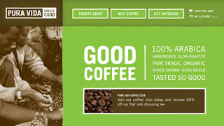
1. Pura Vida.
2. Seattle's Best Coffee.

3. Henrici.

4. Sweet Sallie's.

5. Cilantro's.

6. Kicking Horse Coffee.

7. Robust-ah.

8. 1369 Coffee House.

9. Park Avenue Coffee.

10. Greyhouse Coffee.

11. Dunn Bros. Coffee.

12. Looney Bean Coffee.

13. Bean Exchange.

14. Java Cabana.

15. Cuvee Coffee.

16. Cafe Britt.

17. Starbucks Coffee At Home.

18. Cafe Theatre de la Marionette.

19. Copper Door Coffee Roasters.

20. Melitta, USA.

Read more »
1. Pura Vida.

2. Seattle's Best Coffee.

3. Henrici.

4. Sweet Sallie's.

5. Cilantro's.

6. Kicking Horse Coffee.

7. Robust-ah.

8. 1369 Coffee House.

9. Park Avenue Coffee.

10. Greyhouse Coffee.

11. Dunn Bros. Coffee.

12. Looney Bean Coffee.

13. Bean Exchange.

14. Java Cabana.

15. Cuvee Coffee.

16. Cafe Britt.

17. Starbucks Coffee At Home.

18. Cafe Theatre de la Marionette.

19. Copper Door Coffee Roasters.

20. Melitta, USA.

A good way to know how to arrange your information is to look at how other similar websites arrange theirs. Below are some restaurant websites that caught my attention for both design and information hierarchy.
1. Barley's Greenville.

I liked this site for a number of reasons. The main one being the way in which the menu was laid out. Although it does not have supporting pictures for each item, the rollover effects are interesting. The colour scheme is also very nice.
2. State Restaurant and Cafe.

This restaurant home page is attractive. The colours are nice and the banner is a great idea because it is update-able. Their "Events" page is worth taking note of because of how all the information is displayed. It is concise and easy to figure out.
3. La Vista.

This website is simple yet very classy. I like how they use a large, fixed background image to complement the text. The sections on this site that I thought we very well done were the Menu and Gallery. The use of thumbnails and lightbox in the gallery is a simple but effective solution.
4. Le 28 Thiers.

I like the art direction for this website. The colour scheme is great and the navigation at the top is interesting. Again the use of big background images is something that I liked.
Read more »
1. Barley's Greenville.

I liked this site for a number of reasons. The main one being the way in which the menu was laid out. Although it does not have supporting pictures for each item, the rollover effects are interesting. The colour scheme is also very nice.
2. State Restaurant and Cafe.

This restaurant home page is attractive. The colours are nice and the banner is a great idea because it is update-able. Their "Events" page is worth taking note of because of how all the information is displayed. It is concise and easy to figure out.
3. La Vista.

This website is simple yet very classy. I like how they use a large, fixed background image to complement the text. The sections on this site that I thought we very well done were the Menu and Gallery. The use of thumbnails and lightbox in the gallery is a simple but effective solution.
4. Le 28 Thiers.

I like the art direction for this website. The colour scheme is great and the navigation at the top is interesting. Again the use of big background images is something that I liked.
Below are four commercial websites that I was pretty impressed with. The thing that all 4 of them have in common is the clear navigation and beautiful design. I believe the design is beautiful because the corporate identity is very apparent in each site.
1. Rohm and Haas.

2. conEdison.

3. McDonald's.

4. Levi's Strauss.

Read more »
1. Rohm and Haas.

2. conEdison.

3. McDonald's.

4. Levi's Strauss.

Below is a roundup of some beautiful website design, although they are not all "coffee" websites, they are still an inspiration, methinks.
1. Corvus Design.

2. Oddo Design.

3. Rocket Club.

4. Edgepoint Church.

Read more »
1. Corvus Design.

2. Oddo Design.

3. Rocket Club.

4. Edgepoint Church.

Sunday, 12 September 2010
1. Nature Inspired Painted Background.

2. Viget Inspire Background.

3. Watercolour Effect Menu.


4. Royal Interface.

4. Simple Layout Design.

5. Trendy Geometrical Lines.

6. Handy Web 2.0 Icons.

Read more »

2. Viget Inspire Background.

3. Watercolour Effect Menu.


4. Royal Interface.

4. Simple Layout Design.

5. Trendy Geometrical Lines.

6. Handy Web 2.0 Icons.
To be honest, when I got "Pappa Rich" as the site I had to redesign, I wasn't expecting it to be...that bad. Because firstly, their outlets are pretty well done. I was surprised at how poorly the site was constructed. No offense!
Anyway, to the obvious next step when attempting to revamp a design; Competitor analysis!
1. Starbucks, Malaysia.
This is actually one of the first relevant results when you Google "coffee malaysia". I guess because it is the most widely-known coffee house in the world.
Not particularly impressed with the site, but still worth noting the information arrangement.
2. Coffee Bean and Tea Leaf, Malaysia.
I liked this site. The colour scheme is comfortable and inviting, the images are well displayed, the navigation is very clear and it uses more HTML/CSS rather than just Flash content. Overall, the design and information arrangement is good.
3. Gloria Jean's Coffees, Malaysia.
Gloria Jean's Coffees' Malaysian website is probably not a great example. But there are some good points to take note of. The contact page is concise and to the point. The banners are update-able. Overall not too bad. However (as is the norm, lol) the International site is better than the local one.
4. Old Town Coffee, Malaysia.
When compiling lists, I usually like to save the best for last. I was really blown away by this particular site. The design is beautiful, the navigation is clear, the images are great, the information arrangement is good. I like pretty much everything about this site in terms of design. However, it is an entirely Flash website, so it wouldn't be the best example for coding. Still very impressive, though.
Read more »
Anyway, to the obvious next step when attempting to revamp a design; Competitor analysis!
1. Starbucks, Malaysia.
 | |
| Events Page |
 |
| Home |
Not particularly impressed with the site, but still worth noting the information arrangement.
2. Coffee Bean and Tea Leaf, Malaysia.
 | |
| Home page! |
 |
| "Events" Page |
 |
| Promotions Page |
I liked this site. The colour scheme is comfortable and inviting, the images are well displayed, the navigation is very clear and it uses more HTML/CSS rather than just Flash content. Overall, the design and information arrangement is good.
3. Gloria Jean's Coffees, Malaysia.
 |
| Home |
 |
| About Page. TL;DR. |
 |
| Contact Page |
Gloria Jean's Coffees' Malaysian website is probably not a great example. But there are some good points to take note of. The contact page is concise and to the point. The banners are update-able. Overall not too bad. However (as is the norm, lol) the International site is better than the local one.
4. Old Town Coffee, Malaysia.
 |
| Splash! |
 |
| Home |
 |
| Menu |
 |
| Company profile, "About Us" lah. |
When compiling lists, I usually like to save the best for last. I was really blown away by this particular site. The design is beautiful, the navigation is clear, the images are great, the information arrangement is good. I like pretty much everything about this site in terms of design. However, it is an entirely Flash website, so it wouldn't be the best example for coding. Still very impressive, though.
;;
Subscribe to:
Posts (Atom)