


 Posts


Monday, 20 September 2010

Monday, 13 September 2010
The Internet is a beautiful thing. Access to online tutorials is also a beautiful thing. Below is a list of tutorial URL's that I may be referencing for the development of this project.
1. CSS Tutorials:
2. Photoshop Tutorials:
3. Javascript/JQuery Tutorials:
4. Additional Useful Resources:
Read more »
1. CSS Tutorials:
- Sliding Panel
- Multi-level Menu
- Scalable Breadcrumbs
- Rounded Corners
- Full-page Background Image
- Polaroid Photo Gallery 1
- Polaroid Photo Gallery 2
- Alternative Layouts for IE6
- IE6 Cheatsheet
- 15 CSS Habits
- Useful CSS Techniques
2. Photoshop Tutorials:
- Stencil Art
- Wooden Grunge Portfolio
- Minimalist Website Layout
- Clean and Classy Web Design
- Textured Web Layout
- Elegant Photography Web Layout
- Artistic Web Layout
- Nice Brown Layout
- Ultimate Photoshop Toolbox
- Old-Style Safari Map
- Photo Transfer Edge Effect
- Dreamy Vintage
- Vintage Traveler Diary
- Brushes for Vintage Style Design
- Vintage-looking Image
- Vintage Tutorial DeviantArt
- 30 Dirty Designs
3. Javascript/JQuery Tutorials:
- 50 Useful Techniques and Plugins
- 35 Fresh Tools and Resources
- Javascript for Designers
- 51 Best JQuery Examples
- 45 JQuery Plugins
- 50 Amazing JQuery Examples
4. Additional Useful Resources:
Sunday, 12 September 2010
To be honest, when I got "Pappa Rich" as the site I had to redesign, I wasn't expecting it to be...that bad. Because firstly, their outlets are pretty well done. I was surprised at how poorly the site was constructed. No offense!
Anyway, to the obvious next step when attempting to revamp a design; Competitor analysis!
1. Starbucks, Malaysia.
This is actually one of the first relevant results when you Google "coffee malaysia". I guess because it is the most widely-known coffee house in the world.
Not particularly impressed with the site, but still worth noting the information arrangement.
2. Coffee Bean and Tea Leaf, Malaysia.
I liked this site. The colour scheme is comfortable and inviting, the images are well displayed, the navigation is very clear and it uses more HTML/CSS rather than just Flash content. Overall, the design and information arrangement is good.
3. Gloria Jean's Coffees, Malaysia.
Gloria Jean's Coffees' Malaysian website is probably not a great example. But there are some good points to take note of. The contact page is concise and to the point. The banners are update-able. Overall not too bad. However (as is the norm, lol) the International site is better than the local one.
4. Old Town Coffee, Malaysia.
When compiling lists, I usually like to save the best for last. I was really blown away by this particular site. The design is beautiful, the navigation is clear, the images are great, the information arrangement is good. I like pretty much everything about this site in terms of design. However, it is an entirely Flash website, so it wouldn't be the best example for coding. Still very impressive, though.
Read more »
Anyway, to the obvious next step when attempting to revamp a design; Competitor analysis!
1. Starbucks, Malaysia.
 | |
| Events Page |
 |
| Home |
Not particularly impressed with the site, but still worth noting the information arrangement.
2. Coffee Bean and Tea Leaf, Malaysia.
 | |
| Home page! |
 |
| "Events" Page |
 |
| Promotions Page |
I liked this site. The colour scheme is comfortable and inviting, the images are well displayed, the navigation is very clear and it uses more HTML/CSS rather than just Flash content. Overall, the design and information arrangement is good.
3. Gloria Jean's Coffees, Malaysia.
 |
| Home |
 |
| About Page. TL;DR. |
 |
| Contact Page |
Gloria Jean's Coffees' Malaysian website is probably not a great example. But there are some good points to take note of. The contact page is concise and to the point. The banners are update-able. Overall not too bad. However (as is the norm, lol) the International site is better than the local one.
4. Old Town Coffee, Malaysia.
 |
| Splash! |
 |
| Home |
 |
| Menu |
 |
| Company profile, "About Us" lah. |
When compiling lists, I usually like to save the best for last. I was really blown away by this particular site. The design is beautiful, the navigation is clear, the images are great, the information arrangement is good. I like pretty much everything about this site in terms of design. However, it is an entirely Flash website, so it wouldn't be the best example for coding. Still very impressive, though.
Sunday, 11 July 2010
Hmmm, well it's that time again for the gathering of user feedback.
I do realise that my priorities are all over the place when it comes to assignments, but meh.
Anyway, blogging a few screenshots for Web Design 1 because I'm stuck on ideas for the look. The coding is still a work in progress but that shall be up once I'm done.
1. First Round:
 For this first one, I initially thought to go for a sketchy look. But the problem I faced here was the inconsistency of the pencil strokes and I didn't have enough space because the dimensions were fixed.
2. Second Round:

Ok, dramatic change here. With both design and coding. You can't see it in the screenshot, but it scrolls horizontally. And I decided to go with digitised graphics instead. Menu is fixed at the bottom, centre.
3. Third Attempt:

Ok, not much changed here, just finalised a colour scheme and changed the title banner thing, just some tweaking.
4. Fourth Go, yo.

Graphic enhancement. Menu improved, effects added. (I apologise about the lack of a protoype - It's coming). Background a bit blergh.
5. Current Look:
 So this is what it looks like currently. Still feel that there's something missing or there's something that looks odd, but i can't put my finger on it, I guess I've been looking at it for 3 days straight, so that could be it.
Another shot of the current design:

Screenshot of what an actual section looks like. Format is pretty standard. The other pages are pretty similar, just the graphics are different.
I am kinda annoyed/angry/uninspired at the moment. The site is pissing me off...
Anyway, that is all for now.
Read more »
I do realise that my priorities are all over the place when it comes to assignments, but meh.
Anyway, blogging a few screenshots for Web Design 1 because I'm stuck on ideas for the look. The coding is still a work in progress but that shall be up once I'm done.
1. First Round:

2. Second Round:

Ok, dramatic change here. With both design and coding. You can't see it in the screenshot, but it scrolls horizontally. And I decided to go with digitised graphics instead. Menu is fixed at the bottom, centre.
3. Third Attempt:

Ok, not much changed here, just finalised a colour scheme and changed the title banner thing, just some tweaking.
4. Fourth Go, yo.

Graphic enhancement. Menu improved, effects added. (I apologise about the lack of a protoype - It's coming). Background a bit blergh.
5. Current Look:

Another shot of the current design:

Screenshot of what an actual section looks like. Format is pretty standard. The other pages are pretty similar, just the graphics are different.
I am kinda annoyed/angry/uninspired at the moment. The site is pissing me off...
Anyway, that is all for now.
Monday, 24 May 2010
Yes, I am in a "lame-blog-titles" mood today, >_<.
This is a continuation of the last post. A proposed flowchart for the Website.
It probably raps better than certain rappers anyway, just saying.
As usual, click to enlarge and that sorta shizz, feel me?

Read more »
This is a continuation of the last post. A proposed flowchart for the Website.
It probably raps better than certain rappers anyway, just saying.
As usual, click to enlarge and that sorta shizz, feel me?

This is the next part of the project development.
Creating a moodboard to show the overall feeling and direction of the site. I don't really know if I did it right, but this was sorta what was in my head when I think of what the website will look like.
In other news, I do believe I need to post my flowchart too.
Anyway, moodboard below. Click to enlarge and all that jazz.

Read more »
Creating a moodboard to show the overall feeling and direction of the site. I don't really know if I did it right, but this was sorta what was in my head when I think of what the website will look like.
In other news, I do believe I need to post my flowchart too.
Anyway, moodboard below. Click to enlarge and all that jazz.

Sunday, 16 May 2010
This is my first Web Design 1 assignment blog for semester 5.
Requirements are as follows:-
Photochop/Illustrator Tutorials
This part includes a brief summary about some effects I would like to use in my project. Although the assignment brief only required us to blog about four "interesting" tutorials, I couldn't cut it down to 4, so I'm going to blog about them all. Don't worry, it won't be long, I'm just posting screenshots.
Click on the links to view the full tutorials.
1. How To Design a Sweet Linework & Typography Combo

I would like to use a hand-drawn kind of art direction for my project, so above is a tutorial that teaches you how to digitise your hand-drawn linework in Adobe Illustrator.
2. Turn Any Font Into A Sketch Font
 I really like Rype's tutorials at Vectips.com because they are concise and easy to follow. Not only that, his "type tutorials" are generally all editable, which is pretty darn convenient.
3. Create A Realistic Paper Texture
 So you don't have to worry about finding a paper texture online, plus this is easier on the filesize, not as heavy-duty.
4. Create A Retro Urban Gig Poster

I like the Retro art direction, that's all I want to say on this.
5. How To Make An Animated Paper Robot
 I like robots. I like paper. I liked this tutorial. Yes, I do.
6. Create Bulletin Board With Realistic Shadows
 Bulletin boards are useful. I wish I had one, like, a real one. The cork wood is awesomeness, dontcha know! Plus, you can pin things up on it and you don't even have to push the pin in very hard. Easy! Hah! Also, potential direction, this right here.
7. Create Vector Folk Buildings using Tablet/Tracing
 I like line art. And I like to use my tablet sometimes. Also, this is a filler description, nothing much to say, really, so just filling up the space.
And there you have it! More to come after the jump (well not really). Etc., etc.
Read more »
Requirements are as follows:-
- Screenshot 4 beautiful CSS websites; blog about them
- Screenshot 4 Photochop/Illustrator tutorials; blog about them
- Blog about 3 ideas for "How To…" Website design
Photochop/Illustrator Tutorials
This part includes a brief summary about some effects I would like to use in my project. Although the assignment brief only required us to blog about four "interesting" tutorials, I couldn't cut it down to 4, so I'm going to blog about them all. Don't worry, it won't be long, I'm just posting screenshots.
Click on the links to view the full tutorials.
1. How To Design a Sweet Linework & Typography Combo

I would like to use a hand-drawn kind of art direction for my project, so above is a tutorial that teaches you how to digitise your hand-drawn linework in Adobe Illustrator.
2. Turn Any Font Into A Sketch Font

3. Create A Realistic Paper Texture

4. Create A Retro Urban Gig Poster

I like the Retro art direction, that's all I want to say on this.
5. How To Make An Animated Paper Robot

6. Create Bulletin Board With Realistic Shadows

7. Create Vector Folk Buildings using Tablet/Tracing

And there you have it! More to come after the jump (well not really). Etc., etc.
Saturday, 15 May 2010
This is my first Web Design 1 assignment blog for semester 5.
Requirements are as follows:-
Beautiful CSS Websites
The following websites caught my attention mainly because of the navigation. I like the idea of a fixed navigation because I dislike scrolling all the way up if they page is rather long, it gets annoying.
1. Indofolio – The Portfolio of Gopal Raju, a freelance designer from India

This is the online portfolio of an Indian freelance designer. This site appealed to me for a few reasons, the first reason being the fixed navigation bar at the bottom; as I've mentioned above, I like fixed navigation bars. I also like the art direction and his use of graphics rather than too much text.
2. Legwork Studios / A small design studio located in Denver, CO


This is a website of a small design studio called "Legwork Studios". I like the over all design of this website very much. Again this site has a fixed navigation bar at the bottom. The art direction for this site is one that I personally really like. I like the "ordered chaos" feeling that is achieved through the hand-drawn graphics.
3. Duplos by Ricardo Mestre


This is another online portfolio site, it belongs to Ricardo Mestre from Portugal. Although this site does not have a fixed navigation bar, the collage theme is attractive in my opinion. The background and the trees have a fabric texture on them and the links and buttons are in the form of speech bubbles. Not all the speech bubbles are click-able, however. Only the moving bubbles can be interacted with; static bubbles cannot be clicked.
4. Bowtie, period.

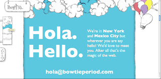


This was my favourite site out of all the ones I've blogged about. The art direction is very appealing to me. And the main thing thing that captured my attention was the great navigation. Again, the navigation bar here is fixed. But the little changes are very cool. For instance, in the left panel, the colour of the section coincides with the little navigation picture; and there is a mascot of some sort in the right panel who changes his attire accordingly. Very trippy design. Really like it.
Read more »
Requirements are as follows:-
- Screenshot 4 beautiful CSS websites; blog about them
- Screenshot 4 Photochop/Illustrator tutorials; blog about them
- Blog about 3 ideas for "How To…" Website design
Beautiful CSS Websites
The following websites caught my attention mainly because of the navigation. I like the idea of a fixed navigation because I dislike scrolling all the way up if they page is rather long, it gets annoying.
1. Indofolio – The Portfolio of Gopal Raju, a freelance designer from India

This is the online portfolio of an Indian freelance designer. This site appealed to me for a few reasons, the first reason being the fixed navigation bar at the bottom; as I've mentioned above, I like fixed navigation bars. I also like the art direction and his use of graphics rather than too much text.
2. Legwork Studios / A small design studio located in Denver, CO


This is a website of a small design studio called "Legwork Studios". I like the over all design of this website very much. Again this site has a fixed navigation bar at the bottom. The art direction for this site is one that I personally really like. I like the "ordered chaos" feeling that is achieved through the hand-drawn graphics.
3. Duplos by Ricardo Mestre


This is another online portfolio site, it belongs to Ricardo Mestre from Portugal. Although this site does not have a fixed navigation bar, the collage theme is attractive in my opinion. The background and the trees have a fabric texture on them and the links and buttons are in the form of speech bubbles. Not all the speech bubbles are click-able, however. Only the moving bubbles can be interacted with; static bubbles cannot be clicked.
4. Bowtie, period.


This was my favourite site out of all the ones I've blogged about. The art direction is very appealing to me. And the main thing thing that captured my attention was the great navigation. Again, the navigation bar here is fixed. But the little changes are very cool. For instance, in the left panel, the colour of the section coincides with the little navigation picture; and there is a mascot of some sort in the right panel who changes his attire accordingly. Very trippy design. Really like it.
Friday, 25 December 2009

Sunday, 25 October 2009
Wah lau! I need to stop over-thinking things when I sample a colour palette. I keep worrying that I am choosing the wrong colour, even though I'm supposed to choose the colours that appeal to me.


Read more »
Anyway, below are some colour palettes that I think can inspire me when doing my mobile and screen interfaces. I found pictures with the keyword "happy", so don't laugh at the pictures, ok!
~~~
First Palette!


This palette is called "Happy and Strange". I named it after the picture that inspired it.
Image is courtesy of =ThePockyMonster on DeviantArt. This is actually my favourite palette from the three that I will post on here, mainly because I like the colour scheme, it makes me feel floaty. Very interesting. Haha!
~~~
Second Palette!


Again, I have named the palette after the image that inspired it. It's called "Happy Chicken". The last colour is white, I should have put a border round the palette because it doesn't show up on my blog because of the white background. *sad face*
Anyway, yes, image is courtesy of =vaporotem on DeviantArt!
~~~
Third Palette!


Ok. I really like the art piece, but the palette is weird. I guess there were just too many colours in the oil painting, I just chose a little bit of it and sampled colours from that. Not too happy with this one, but I reckon it will look very nice against white.
Palette is called "Happy Street". Image courtesy of =Leonidafremov on DeviantArt. Awesome piece, I think, ^_^
Wednesday, 7 October 2009
Alright.
Icons are due this Friday.
I have finished one vector one almost.
Almost.

I made this one accidentally.
See, so some accidents are a blessing in disguise! It's very ugly, colourwise, and I haven't completed my icon yet, I just want to post the umbrella before I make any more changes.
Saved the file as PNG this time.
I am proud of myself, I did this without the use of online resources. But then again it was by accident.
Oh well.
Friday, 11 September 2009
Why do I always call the first entry, "First Entry"?
Read more »
Anyway, new blog!
Now, I know I have had many "new blogs" in the past, only one of them actually having stood the test of time, but this one here is for school, so it will probably endure. I hope. Anyway, the others have faded into obscurity, like those oh-so-awesome One Hit Wonders, because I never maintained them.
Maintaining multiple blogs requires each blog to focus on something different, to keep things interesting; unless you don't mind writing the same things in all of them, in which case you don't need much new material, therefore the maintenance of your many blogs will not be so much of a challenge.
I will just explain this blog under some broad headings before I start properly utilising it, like, properly.
URL
The URL is supposed to be funny. It is a combination of the words "melatonin" and "ninja". I decided to use this name because I actually have a Google Account by the same name that I have never really used for, well, anything. The only reason I registered that user name was so nobody else could take it. Because someone already has the one I wanted, which was "Serotoninja". But it's ok because I've visited his blog and he writes very well, XD
Melatonin - is a hormone secreted in the pituitary gland. It helps regulate sleep/wake patterns in mammals, among other functions. I like this hormone because when I was in Medical school, this topic really piqued my interest, ^_^
Ninja - in Japanese history, a ninja is a warrior specially trained in unorthodox methods of war. Like, spying, espionage, etc., etc. Now, we just use the word very loosely. I have ninja shoes, but that's for another post. On another blog, haha!
Purpose
I will be using this blog in an attempt to better organise my "school things". And related things. It's a good thing my other blog has absolutely no substance, because that means this one still has a chance at survival.
Design
I have tried to use a white background to keep this blog "clean". (That word means more than you'd think.) Big contrast with my other blog, which has a darker background and is much messier.
The Chat/Shout Box - This widget is called Loose Change. Again, this is supposed to be a joke. Because of the expression, "two-cents worth". Loose Change, get it? Yes, I laugh at things that aren't particularly funny.
Oh well.
Alright, so that's pretty much the long and short of it. This pilot entry is just an excuse to fill up space and create some labels because I don't like how new blogs are always so empty.
;;
Subscribe to:
Posts (Atom)


