


 Posts


Monday, 13 September 2010
The Internet is a beautiful thing. Access to online tutorials is also a beautiful thing. Below is a list of tutorial URL's that I may be referencing for the development of this project.
1. CSS Tutorials:
2. Photoshop Tutorials:
3. Javascript/JQuery Tutorials:
4. Additional Useful Resources:
Read more »
1. CSS Tutorials:
- Sliding Panel
- Multi-level Menu
- Scalable Breadcrumbs
- Rounded Corners
- Full-page Background Image
- Polaroid Photo Gallery 1
- Polaroid Photo Gallery 2
- Alternative Layouts for IE6
- IE6 Cheatsheet
- 15 CSS Habits
- Useful CSS Techniques
2. Photoshop Tutorials:
- Stencil Art
- Wooden Grunge Portfolio
- Minimalist Website Layout
- Clean and Classy Web Design
- Textured Web Layout
- Elegant Photography Web Layout
- Artistic Web Layout
- Nice Brown Layout
- Ultimate Photoshop Toolbox
- Old-Style Safari Map
- Photo Transfer Edge Effect
- Dreamy Vintage
- Vintage Traveler Diary
- Brushes for Vintage Style Design
- Vintage-looking Image
- Vintage Tutorial DeviantArt
- 30 Dirty Designs
3. Javascript/JQuery Tutorials:
- 50 Useful Techniques and Plugins
- 35 Fresh Tools and Resources
- Javascript for Designers
- 51 Best JQuery Examples
- 45 JQuery Plugins
- 50 Amazing JQuery Examples
4. Additional Useful Resources:
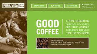
So, in the final "Website Inspiration" showcase, I've included some sites about coffee. Coz coffee smells nice and stuff.
1. Pura Vida.
2. Seattle's Best Coffee.

3. Henrici.

4. Sweet Sallie's.

5. Cilantro's.

6. Kicking Horse Coffee.

7. Robust-ah.

8. 1369 Coffee House.

9. Park Avenue Coffee.

10. Greyhouse Coffee.

11. Dunn Bros. Coffee.

12. Looney Bean Coffee.

13. Bean Exchange.

14. Java Cabana.

15. Cuvee Coffee.

16. Cafe Britt.

17. Starbucks Coffee At Home.

18. Cafe Theatre de la Marionette.

19. Copper Door Coffee Roasters.

20. Melitta, USA.

Read more »
1. Pura Vida.

2. Seattle's Best Coffee.

3. Henrici.

4. Sweet Sallie's.

5. Cilantro's.

6. Kicking Horse Coffee.

7. Robust-ah.

8. 1369 Coffee House.

9. Park Avenue Coffee.

10. Greyhouse Coffee.

11. Dunn Bros. Coffee.

12. Looney Bean Coffee.

13. Bean Exchange.

14. Java Cabana.

15. Cuvee Coffee.

16. Cafe Britt.

17. Starbucks Coffee At Home.

18. Cafe Theatre de la Marionette.

19. Copper Door Coffee Roasters.

20. Melitta, USA.

A good way to know how to arrange your information is to look at how other similar websites arrange theirs. Below are some restaurant websites that caught my attention for both design and information hierarchy.
1. Barley's Greenville.

I liked this site for a number of reasons. The main one being the way in which the menu was laid out. Although it does not have supporting pictures for each item, the rollover effects are interesting. The colour scheme is also very nice.
2. State Restaurant and Cafe.

This restaurant home page is attractive. The colours are nice and the banner is a great idea because it is update-able. Their "Events" page is worth taking note of because of how all the information is displayed. It is concise and easy to figure out.
3. La Vista.

This website is simple yet very classy. I like how they use a large, fixed background image to complement the text. The sections on this site that I thought we very well done were the Menu and Gallery. The use of thumbnails and lightbox in the gallery is a simple but effective solution.
4. Le 28 Thiers.

I like the art direction for this website. The colour scheme is great and the navigation at the top is interesting. Again the use of big background images is something that I liked.
Read more »
1. Barley's Greenville.

I liked this site for a number of reasons. The main one being the way in which the menu was laid out. Although it does not have supporting pictures for each item, the rollover effects are interesting. The colour scheme is also very nice.
2. State Restaurant and Cafe.

This restaurant home page is attractive. The colours are nice and the banner is a great idea because it is update-able. Their "Events" page is worth taking note of because of how all the information is displayed. It is concise and easy to figure out.
3. La Vista.

This website is simple yet very classy. I like how they use a large, fixed background image to complement the text. The sections on this site that I thought we very well done were the Menu and Gallery. The use of thumbnails and lightbox in the gallery is a simple but effective solution.
4. Le 28 Thiers.

I like the art direction for this website. The colour scheme is great and the navigation at the top is interesting. Again the use of big background images is something that I liked.
Below are four commercial websites that I was pretty impressed with. The thing that all 4 of them have in common is the clear navigation and beautiful design. I believe the design is beautiful because the corporate identity is very apparent in each site.
1. Rohm and Haas.

2. conEdison.

3. McDonald's.

4. Levi's Strauss.

Read more »
1. Rohm and Haas.

2. conEdison.

3. McDonald's.

4. Levi's Strauss.

Sunday, 12 September 2010
To be honest, when I got "Pappa Rich" as the site I had to redesign, I wasn't expecting it to be...that bad. Because firstly, their outlets are pretty well done. I was surprised at how poorly the site was constructed. No offense!
Anyway, to the obvious next step when attempting to revamp a design; Competitor analysis!
1. Starbucks, Malaysia.
This is actually one of the first relevant results when you Google "coffee malaysia". I guess because it is the most widely-known coffee house in the world.
Not particularly impressed with the site, but still worth noting the information arrangement.
2. Coffee Bean and Tea Leaf, Malaysia.
I liked this site. The colour scheme is comfortable and inviting, the images are well displayed, the navigation is very clear and it uses more HTML/CSS rather than just Flash content. Overall, the design and information arrangement is good.
3. Gloria Jean's Coffees, Malaysia.
Gloria Jean's Coffees' Malaysian website is probably not a great example. But there are some good points to take note of. The contact page is concise and to the point. The banners are update-able. Overall not too bad. However (as is the norm, lol) the International site is better than the local one.
4. Old Town Coffee, Malaysia.
When compiling lists, I usually like to save the best for last. I was really blown away by this particular site. The design is beautiful, the navigation is clear, the images are great, the information arrangement is good. I like pretty much everything about this site in terms of design. However, it is an entirely Flash website, so it wouldn't be the best example for coding. Still very impressive, though.
Read more »
Anyway, to the obvious next step when attempting to revamp a design; Competitor analysis!
1. Starbucks, Malaysia.
 | |
| Events Page |
 |
| Home |
Not particularly impressed with the site, but still worth noting the information arrangement.
2. Coffee Bean and Tea Leaf, Malaysia.
 | |
| Home page! |
 |
| "Events" Page |
 |
| Promotions Page |
I liked this site. The colour scheme is comfortable and inviting, the images are well displayed, the navigation is very clear and it uses more HTML/CSS rather than just Flash content. Overall, the design and information arrangement is good.
3. Gloria Jean's Coffees, Malaysia.
 |
| Home |
 |
| About Page. TL;DR. |
 |
| Contact Page |
Gloria Jean's Coffees' Malaysian website is probably not a great example. But there are some good points to take note of. The contact page is concise and to the point. The banners are update-able. Overall not too bad. However (as is the norm, lol) the International site is better than the local one.
4. Old Town Coffee, Malaysia.
 |
| Splash! |
 |
| Home |
 |
| Menu |
 |
| Company profile, "About Us" lah. |
When compiling lists, I usually like to save the best for last. I was really blown away by this particular site. The design is beautiful, the navigation is clear, the images are great, the information arrangement is good. I like pretty much everything about this site in terms of design. However, it is an entirely Flash website, so it wouldn't be the best example for coding. Still very impressive, though.
So the new semester has begun.
This semester's brief requires us to redesign an existing corporate website. Below is the first part of initial planning:
Below is the site map of the existing website. There are quite a few things I would like to propose to change. I will cover that in a coming post, stay tuned!
Read more »
This semester's brief requires us to redesign an existing corporate website. Below is the first part of initial planning:
 |
| Gantt Chart, blergh! |
Below is the site map of the existing website. There are quite a few things I would like to propose to change. I will cover that in a coming post, stay tuned!
 |
| Site Map, for serious! |
Sunday, 16 May 2010
This is my first Web Design 1 assignment blog for semester 5.
Requirements are as follows:-
Ideas For "How To…" Website
Below are three potential ideas I came up with for my project. The general brief is to design/create a "tutorial" kind of website design, teaching the user "How To…" do a certain thing. Basic requirement is 8 pages, but we might end up having more.
1. How To Rule The World With An Iron Fist
2. How To Lead Your Own Cult
3. How To Get Your Homework Done On Time
Read more »
Requirements are as follows:-
- Screenshot 4 beautiful CSS websites; blog about them
- Screenshot 4 Photochop/Illustrator tutorials; blog about them
- Blog about 3 ideas for "How To…" Website design
Ideas For "How To…" Website
Below are three potential ideas I came up with for my project. The general brief is to design/create a "tutorial" kind of website design, teaching the user "How To…" do a certain thing. Basic requirement is 8 pages, but we might end up having more.
1. How To Rule The World With An Iron Fist
- WHO AM I – A short megalomaniac who is compensating for his height deficiency
- WHAT IS IT – A New World Order. Total Dictatorship, ^_^.
- WHAT FOR – To implement a New World Order. Viva la Revolucion
- 1st task – Topple the current World leaders with your Ant Army
- 2nd task – Appoint self as Supreme World Leader and re-evaluate land ownership/territories. Give your friends land, enslave non-friends.
- 3rd task – Display your unrivaled authority by a grand show of power. And make an official Facebook page.
- OUTCOME – A more peaceful World where everything goes your way.
- SHOWCASE – Ant Army, Killer Robot, snapshots with friends, enslaved non-friends. King's Official Facebook page.
2. How To Lead Your Own Cult
- WHO AM I – A highly evolved being who can communicate with the Gods
- WHAT IS IT – The true way in which the Gods intended us to live
- WHAT FOR – To open the eyes of the blind, show them their true selves.
- 1st task – Amass a substantial amount of followers.
- 2nd task – Build a commune for your following to live and be closer to the Gods.
- 3rd task – Lead your following into the light of a new age. Transcend this world to a higher plane.
- OUTCOME – Mass enlightenment of the population.
- SHOWCASE – Brain-washing machine, uniforms, official song and dance.
3. How To Get Your Homework Done On Time
- WHO AM I – A highly intelligent, yet extremely lazy student.
- WHAT IS IT – A Homework Robot
- WHAT FOR – Make sure homework is always done on time.
- 1st task – Download your memories and thought patterns and export them as CSV format file.
- 2nd task – Build a Homework robot, synthesised with your own DNA.
- 3rd task – Boot up the robot's operating system with all the data from step one.
- OUTCOME – Your homework will always be done on time.
- SHOWCASE – Initial sketches, DNA, Robot
This is my first Web Design 1 assignment blog for semester 5.
Requirements are as follows:-
Photochop/Illustrator Tutorials
This part includes a brief summary about some effects I would like to use in my project. Although the assignment brief only required us to blog about four "interesting" tutorials, I couldn't cut it down to 4, so I'm going to blog about them all. Don't worry, it won't be long, I'm just posting screenshots.
Click on the links to view the full tutorials.
1. How To Design a Sweet Linework & Typography Combo

I would like to use a hand-drawn kind of art direction for my project, so above is a tutorial that teaches you how to digitise your hand-drawn linework in Adobe Illustrator.
2. Turn Any Font Into A Sketch Font
 I really like Rype's tutorials at Vectips.com because they are concise and easy to follow. Not only that, his "type tutorials" are generally all editable, which is pretty darn convenient.
3. Create A Realistic Paper Texture
 So you don't have to worry about finding a paper texture online, plus this is easier on the filesize, not as heavy-duty.
4. Create A Retro Urban Gig Poster

I like the Retro art direction, that's all I want to say on this.
5. How To Make An Animated Paper Robot
 I like robots. I like paper. I liked this tutorial. Yes, I do.
6. Create Bulletin Board With Realistic Shadows
 Bulletin boards are useful. I wish I had one, like, a real one. The cork wood is awesomeness, dontcha know! Plus, you can pin things up on it and you don't even have to push the pin in very hard. Easy! Hah! Also, potential direction, this right here.
7. Create Vector Folk Buildings using Tablet/Tracing
 I like line art. And I like to use my tablet sometimes. Also, this is a filler description, nothing much to say, really, so just filling up the space.
And there you have it! More to come after the jump (well not really). Etc., etc.
Read more »
Requirements are as follows:-
- Screenshot 4 beautiful CSS websites; blog about them
- Screenshot 4 Photochop/Illustrator tutorials; blog about them
- Blog about 3 ideas for "How To…" Website design
Photochop/Illustrator Tutorials
This part includes a brief summary about some effects I would like to use in my project. Although the assignment brief only required us to blog about four "interesting" tutorials, I couldn't cut it down to 4, so I'm going to blog about them all. Don't worry, it won't be long, I'm just posting screenshots.
Click on the links to view the full tutorials.
1. How To Design a Sweet Linework & Typography Combo

I would like to use a hand-drawn kind of art direction for my project, so above is a tutorial that teaches you how to digitise your hand-drawn linework in Adobe Illustrator.
2. Turn Any Font Into A Sketch Font

3. Create A Realistic Paper Texture

4. Create A Retro Urban Gig Poster

I like the Retro art direction, that's all I want to say on this.
5. How To Make An Animated Paper Robot

6. Create Bulletin Board With Realistic Shadows

7. Create Vector Folk Buildings using Tablet/Tracing

And there you have it! More to come after the jump (well not really). Etc., etc.
Saturday, 15 May 2010
This is my first Web Design 1 assignment blog for semester 5.
Requirements are as follows:-
Beautiful CSS Websites
The following websites caught my attention mainly because of the navigation. I like the idea of a fixed navigation because I dislike scrolling all the way up if they page is rather long, it gets annoying.
1. Indofolio – The Portfolio of Gopal Raju, a freelance designer from India

This is the online portfolio of an Indian freelance designer. This site appealed to me for a few reasons, the first reason being the fixed navigation bar at the bottom; as I've mentioned above, I like fixed navigation bars. I also like the art direction and his use of graphics rather than too much text.
2. Legwork Studios / A small design studio located in Denver, CO


This is a website of a small design studio called "Legwork Studios". I like the over all design of this website very much. Again this site has a fixed navigation bar at the bottom. The art direction for this site is one that I personally really like. I like the "ordered chaos" feeling that is achieved through the hand-drawn graphics.
3. Duplos by Ricardo Mestre


This is another online portfolio site, it belongs to Ricardo Mestre from Portugal. Although this site does not have a fixed navigation bar, the collage theme is attractive in my opinion. The background and the trees have a fabric texture on them and the links and buttons are in the form of speech bubbles. Not all the speech bubbles are click-able, however. Only the moving bubbles can be interacted with; static bubbles cannot be clicked.
4. Bowtie, period.



This was my favourite site out of all the ones I've blogged about. The art direction is very appealing to me. And the main thing thing that captured my attention was the great navigation. Again, the navigation bar here is fixed. But the little changes are very cool. For instance, in the left panel, the colour of the section coincides with the little navigation picture; and there is a mascot of some sort in the right panel who changes his attire accordingly. Very trippy design. Really like it.
Read more »
Requirements are as follows:-
- Screenshot 4 beautiful CSS websites; blog about them
- Screenshot 4 Photochop/Illustrator tutorials; blog about them
- Blog about 3 ideas for "How To…" Website design
Beautiful CSS Websites
The following websites caught my attention mainly because of the navigation. I like the idea of a fixed navigation because I dislike scrolling all the way up if they page is rather long, it gets annoying.
1. Indofolio – The Portfolio of Gopal Raju, a freelance designer from India

This is the online portfolio of an Indian freelance designer. This site appealed to me for a few reasons, the first reason being the fixed navigation bar at the bottom; as I've mentioned above, I like fixed navigation bars. I also like the art direction and his use of graphics rather than too much text.
2. Legwork Studios / A small design studio located in Denver, CO


This is a website of a small design studio called "Legwork Studios". I like the over all design of this website very much. Again this site has a fixed navigation bar at the bottom. The art direction for this site is one that I personally really like. I like the "ordered chaos" feeling that is achieved through the hand-drawn graphics.
3. Duplos by Ricardo Mestre


This is another online portfolio site, it belongs to Ricardo Mestre from Portugal. Although this site does not have a fixed navigation bar, the collage theme is attractive in my opinion. The background and the trees have a fabric texture on them and the links and buttons are in the form of speech bubbles. Not all the speech bubbles are click-able, however. Only the moving bubbles can be interacted with; static bubbles cannot be clicked.
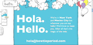
4. Bowtie, period.


This was my favourite site out of all the ones I've blogged about. The art direction is very appealing to me. And the main thing thing that captured my attention was the great navigation. Again, the navigation bar here is fixed. But the little changes are very cool. For instance, in the left panel, the colour of the section coincides with the little navigation picture; and there is a mascot of some sort in the right panel who changes his attire accordingly. Very trippy design. Really like it.
;;
Subscribe to:
Posts (Atom)


