Friday 25 December 2009

Merry Christmas Everyone!

Read more »
Read more »

Thursday 3 December 2009

I haven't posted anything here since October.

I admit that I have been kind of lazy about blogging.

Anyway, I have been playing a lot of Pet Society these days, and I think some of the decoration themes are very attractive, colour-wise. So I decided to collect some colour palettes from my rooms in Pet Society.

This first one is from the Wonderland theme. It's mysterious and magical. The colours are cool and low key.


I sampled two palettes from this because the different elements had different combinations of colours and I think it's worth sampling all the colours.

This first palette was taken from the wallpaper in the background:


And this second palette was sampled from the lake in the middle ground. Some of the colours are similar to that of the first one, but they are less saturated.


The other theme I sampled was the Autumn Faerie theme. Again, I sampled various parts of the whole piece because of the different colour combinations.


This first palette was taken from the leaves at the top of the wallpaper:


This second palette was sampled from the Faerie four-poster bed. The colours here are more saturated that the previous palette and they stand out more. Giving it good contrast against the background:


This third palette is very similar to the first one, but I sampled it from the mushrooms in at the bottom of the wallpaper. The reason I made another palette was because of the interesting colour combinations:


Anyway, at the moment, I am trying to fix my CS4 and make a new layout for my blog, so once that is done, I shall post updates.

Until then, enjoy the beautiful colour palettes, ^_^
Read more »
Read more »

Sunday 25 October 2009

Header Has Compass!

Yes, a quick update!

I have changed the header for this blog.

As usual, it is transitory, temporary. Until the next one, that is.

The map used for the background is an actual KL map. And the compass was the one I made a while back, the font is courtesy of DaFont.com and I used Photochop! to throw everything together.

That is all for this update, there is nothing more I have to mention.

End.
Read more »
Read more »

Colour Palettes!

Wah lau! I need to stop over-thinking things when I sample a colour palette. I keep worrying that I am choosing the wrong colour, even though I'm supposed to choose the colours that appeal to me.

Anyway, below are some colour palettes that I think can inspire me when doing my mobile and screen interfaces. I found pictures with the keyword "happy", so don't laugh at the pictures, ok!

~~~

First Palette!


This palette is called "Happy and Strange". I named it after the picture that inspired it.
Image is courtesy of =ThePockyMonster on DeviantArt. This is actually my favourite palette from the three that I will post on here, mainly because I like the colour scheme, it makes me feel floaty. Very interesting. Haha!

~~~

Second Palette!


Again, I have named the palette after the image that inspired it. It's called "Happy Chicken". The last colour is white, I should have put a border round the palette because it doesn't show up on my blog because of the white background. *sad face*

Anyway, yes, image is courtesy of =vaporotem on DeviantArt!

~~~

Third Palette!


Ok. I really like the art piece, but the palette is weird. I guess there were just too many colours in the oil painting, I just chose a little bit of it and sampled colours from that. Not too happy with this one, but I reckon it will look very nice against white.

Palette is called "Happy Street". Image courtesy of =Leonidafremov on DeviantArt. Awesome piece, I think, ^_^

Read more »
Read more »

Tuesday 13 October 2009

Flowcharts Part II

So this is a continuation form the previous post; for the second part of the assignment, I need to answer some questions, scan through responses and respond to two or more participants who left comments on my blog. Must give feedback.

So the questions are:

1. Why do you want to use a flowchart in your mobile and screen interface design?
After watching the videos, I realise that organising the whole process into a flowchart will illustrate a clearer picture of how exactly the interface would work. Drawing out the sequence of tasks and outcomes will help to avoid any lose ends and undesired oversights in design. A planning process.see the whole thing at a glance

2. How will it help your users to meet the interactive goals?
With interactive cards and such, the whole point of it is to get the user from the beginning until the end, with some interaction in between. It's all about planning , I guess. By specifying exactly what kinds of tasks you will be using, how the tasks are all co-related and what outcome is to be achieved, you will have laid out a roadmap for the users.

So basically, they help to organise ideas in a visual way say you can see the whole thing at a glance.

Now! I must go stalk my friends' blogs and comment on their posts.
Read more »
Read more »

Flowcharts Part I

The assignment post for today is on "Flowcharts". It's sort of like a prerequisite step of sorts for our final project, you know, watching the videos and reading the material and all. If you don't read, then you stand outside and no happy lecture time for you on Friday. Yes, it's that important!

Anyway, I have just finished watching the video resources that we got, on Monday, but I could only find one on YouTube. But then most of them were roughly covering the same things, so I will just embed that one video here, yay!


I didn't even know that there were specific shapes that had to be used when drawing "professional flowcharts". I remember drawing any kind of shape I wanted when I was in school, XD.
...there were specific shapes that had to be used...

And the video below gives tips on how to increase traffic to promote your business, blog, etc. Quite good, I reckon. It is also embedded below for your viewing pleasure, ^_^


Alright, so basically, we are required to apply the theory of the flowchart into the development of our mobile/screen interface designs. And I guess the second video is for user testing and feedback?

Ok. So there are two parts to this assignment. The first one being the watching of the videos and reading of online material, and the second part requires some thought. Well, more thought than the first part anyway. I shall put the second part in another post because this one is getting too long.


Read more »
Read more »

Saturday 10 October 2009

Hi there!

Our most recent assignment submission was a "series" of icons.

So, building on that, we are required to collect user feedback in order to improve on the design.

So, I need your help!


All you need to do is answer the following questions in regards to my icons:

1. Can you tell what each icon represents?
(e.g: Settings, Help, About Us, Contact, WiFi, etc.)

2. Is the function of each icon clear enough, or did you have to think about what it was?

3. Based on colour, do the icons appeal to you?

4. If I designed a website for you, would you want to use these icons?

5. What do you dislike about the icons?
  • Colour
  • Graphics
  • Workmanship (not neat enough?)
  • Function not obvious
6. What did you like about the icons?
  • Colour
  • Graphics
  • Workmanship (neat, tidy?)
  • Function is obvious, easy to identify
7. What about the workmanship? Do you think the finished designs are neat/messy/tacky/cheap-looking/6-year-old could do better?

8. Last question! Any comments to help me improve them? Anything I should keep/lose?

~~~

Edit: Forgot to mention! If you can't leave a comment on here, email me your answers or leave them in a comment on my Facebook!

Alright, thank you in advance for your help, I shall thank you again properly once you've posted your feedback in a comment!
Read more »
Read more »

Wednesday 7 October 2009

Bad Luck Umbrella!

Alright.

Icons are due this Friday.

I have finished one vector one almost.

Almost.


I made this one accidentally.

See, so some accidents are a blessing in disguise! It's very ugly, colourwise, and I haven't completed my icon yet, I just want to post the umbrella before I make any more changes.

Saved the file as PNG this time.

I am proud of myself, I did this without the use of online resources. But then again it was by accident.

Oh well.
Read more »
Read more »

Tuesday 6 October 2009

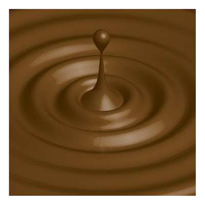
Caramel Ripples!

Yes, I have done another tutorial.

I particularly enjoyed doing this one because of how simple yet methodical it is. I got the result below in only nine steps.
This tutorial is good practice for using tools such as "Distort" and "3D Revolve".

Nothing too fancy, but still very effective, ^_^!
Read more »
Read more »

Monday 5 October 2009

The Golden Compass!

I have not been updating this blog very frequently, aye?

I guess it's because we only have one MM subject this semester, but I assure you, next semester, I will update so frequently, you will be so tired of seeing the new entries. Yes, I said "you" but I don't know who I was referring to.

Anyway, yesterday (because it's after midnight), we had our first DDMM class in a week or so. We didn't have classes last week because of the Starlite event. Yes, so class yesterday was good. Was mostly critique sessions.

In other news, I made this pretty compass thing!

I reckon the method in which the alarm clock was made was more systematic. I like systematic. Yes, anyway, I followed the tutorial to the letter, but I wasn't very happy with the way they apply the shadow. They used the"Mesh" tool and added points in the sphere, coloured the points and then resized (squished) it to get the shadow.

It looks pretty good on a white background, but when you try to apply a coloured background to the picture, the whole thing is white and there is a huge white ellipse under the compass. Not cool. But yes, better keep it on a white background if you are following the tutorial to the letter, that is.

And if you find a way around it, please post it in a comment or something!

That is all.
Read more »
Read more »

Friday 2 October 2009

Starlite, Starlite!

The Multimedia Department organised a week-long event for the MM students.

It's over now, and I think that we all gained a lot from the sharing sessions. We had a lot of talented people come talk to us about their personal experiences, the problems they faced, what they gained and the way in which they went about bringing their ideas to life.

Monday
There was a team building exercise, however, our class did not participate become our Monday lectures could not be rescheduled. So, this section will be short.

Tuesday
We had three speakers talk to us on Tuesday. They spoke about their project: "Fight Masters: Silat", which was a documentary they had made for the National Geographic Channel. The documentary follows an American marine, called Joel Champ, who embarks on a "journey" to become the first westerner to gain three strips on his Silat black belt. His shi fu and mentor, Sam, believes this "journey" to be a rite of passage.

Our three speakers for that day were, Justin Ong (director), Khairun Lamb (cameraman) and Steven (forgot his surname) was the representative from Young Jump Animation (CGI). They discussed the conceptualisation, pitching of the idea, thought process, execution and pitfalls they encountered along the way, among other things. It was an interesting talk, however, I feel that it was a little lost on me because I did not know any questions to ask.

Wednesday
On Wednesday, Jimmy Tan, a former TOA student, came to share his experiences. He graduated with a diploma in Illustration but later realised that he was more inclined to pursue a career in graphics. So, now, I guess we can look at him as a multimedia designer since he designs tshirts for Threadless, dabbles in wall art, and many many other areas. He is the founder of Numb9r and is by all means a very very successful young designer. He was very nervous during his presentation, but the important thing is, we still learnt something from him.

Thursday
The "Six Thinking Hats" was the next order of business. We learnt about the concept made famous by Edward de Bono. We did some exercises to help us better understand the function of each hat. White, Red, Yellow, Black, Green and Blue. I feel that this was a particularly useful workshop because it taught us practical skills that we can ultimately incorporate into our future group discussions and preparations for presentations. I feel really bad for forgetting the speaker's name because she took time out of her busy schedule to come all the way from Singapore to talk to us.

Friday
Today was the last day for sharing. Six hours! Wah lau eh. So tired. But, in my personal opinion, today was the most relevant day. Well, for me anyway. Hearing from our seniors, our peers, those who have actually gone through the same subjects that we will eventually take ourselves , was the most valuable sharing session of the whole week. For me, that is. The speakers discussed their design process with us, giving us advice and telling anecdotes of the difficulties they faced, whether big or small. At the end of the day, I didn't really mind freezing in the AVH for 6 hours because I believe my outlook has been greatly improved.

Jimmy Tan actually asked us whether any of us felt that we were pursuing the wrong major. Nobody hesitated when we all yelled "nooooooo" in unison. I truly believe that I will enjoy studying Multimedia Design for the next two years or so because doubt doesn't factor in anywhere.

The Starlite event was inspirational and motivating. The Multimedia Department did an exception job, ^_^.
Read more »
Read more »

Saturday 26 September 2009

Vote Now!

Short post.

Please click on the link below and then click the "thumbs up" icon to vote!

Read more »
Read more »

Friday 25 September 2009

Two More Cute Clocks!

Ok!

I have just finished the bronze clock!
I don't know how it turned out and I am not sure whether or not I am happy with it.

Anyway. I have learnt a very important lesson by doing this assignment. I just started making the clock without checking to see what colour mode I had set the document to. By default, it was set to CMYK, so when I attempted to post the finished clocks on this blog, the colour was all messed up.

So, it is very, very, VERY, VERY, very, VERY important to check the colour mode thing BEFORE you start doing your assignment. I have finally changed all the colour modes to RGB.

Anyway, after I finished the bronze clock in Illustrator, I exported the file to Photochop and played with the colour balance to get a blue colour scheme. I like the blue, but I'm not sure if the light and shadow play is realistic enough.

Anyway, two cute little alarm clocks! Enjoy, enjoy!

The BRONZE one


And the BLUE clock:


----------------
Now playing: Third Eye Blind - How's It Going To Be (1997)
via FoxyTunes
Read more »
Read more »

Glossy Icons FTW!

We made glossy icons in class today.

It is so much more fun than it sounds, you know! Anyway, I just post mine here!


S-button. It's pink! First attempt, so don't look too closely.

And this here is an alarm clock! (Click to enlarge). It's all stainless stain and such. I will make a bronze coloured one later this weekend, so watch this space for updates.


Will try to write some more entries over the weekend.

That is all.
Read more »
Read more »

Saturday 19 September 2009

Pixel Buddy!


Class assignment: make a little pixel avatar of your friend.

People were paired up and, with the powerful weapon that is Photoshop, we created a little pixel avatar/buddy/thing icon of the other half of our pair.

I made a mini-Liang Shing.

The end.
Read more »
Read more »

Where did Nongkyndong go?

I have just transferred this blog to another one of my Google Accounts.

My dashboard of my main account was getting a little too crowded.

So, Nongkyndong will no longer be posting here. Instead! All posts will be made by the Melatoninja. Now, I do realise that this point is extremely pointless seeing as both pseudonyms (pen names?) refer to me. I do believe that it will be relevant one day. But not today.

Anyway, still have a lot to do to this blog. It is a work in progress, so this isn't the final layout.

This is a short update.
Read more »
Read more »

Hey MM0901-1, I'm going to post the material list for the Visual Communication final project here.

So, please let me know what all you will be getting before next weeks class, k?

Read more »
Read more »

Friday 11 September 2009

Yes, this is the first so called "assignment blog post", Ten Things That Describe Me.

So, basically, we have to list ten things that describe us. I don't think it's a top ten sort of thing. Just ten random things. I'm going to use headings!

1. Gemini
I was born between 20th May and 21st June, so that makes me a Gemini. I don't really obsess about the whole astrological "profiling", but sometimes it is pretty accurate.

2. Transient
I like to move around, different houses, different towns, different countries. I don't like staying in one place for too long, I get restless. I guess this is because my dad moved us around a lot when I was younger. I like the whole process of moving; sorting out the things you need, throwing out the things that you don't and not being able to throw out certain things.

3. Pack rat/Magpie
I tend to accumulate unnecessary things, always rationalising that I will have a use for it some day.

4. Reading
I enjoy reading. But, I haven't done much reading this year. Ten (not Top ten, random ten) of my favourite books are:
  • "The Lord of the Rings" by J.R.R. Tolkien
  • "The Kite Runner" by Khaled Hosseini
  • "20th Century Ghosts" by Joe Hill
  • "One Were Warriors" by Alan Duff
  • "Tales of the Tikongs" by Epeli Ha'ofa
  • "The Tenderness of Wolves" by Stef Penney
  • "The Count of Monte Cristo" Alexandre Dumas
  • "Little Women" Louisa May Alcott
  • "Rape: A Love Story" Joyce Carol Oates
  • "To Kill A Mocking Bird" Harper Lee

5. 90's Music
I like to listen to bands of the 90's. The songs make me nostalgic because I remember them playing on the radio in my childhood. Rock, any kind of Rock, from the 90's is seemingly timeless, it just gets better with age. But I do like a lot of new music too. I listen to everything, my taste in music is very random; any genre, any artist (except Akon). I don't usually admit this in public, but my playlist has some pop; some Britney, Taylor Swift and Mandy Moore. Haha! But listed below are ten (random) songs from my iTunes "Top 25 Most Played" list:
  • "Sharing The Night Together" Dr. Hook
  • "Always Be My Baby" David Cook
  • "Not Meant To Be" Theory of a Dead Man
  • "Not Ready To Make Nice" The Dixie Chicks
  • "Windmills" Toad the Wet Sprocket
  • "Hawa Me Urta Jaya" The Bombay Vikings
  • "Every Little Thing" Dishwalla
  • "Long Long Way To Go" Def Leppard
  • "Meet Virginia" Train
  • "Drops of Jupiter" Train

6. Laughter
I like laughing. I like making people laugh. I love sitcoms like "Friends" and "Arrested Development". Both shows are no longer running, but the humour on those shows was very original. "Friends" ran for ten seasons! That's the longest running TV show ever! But Arrested Development discontinued after the third season. Which is sad because that was a great show.

7. Videos
I like watching YouTube videos. I'm going to list ten (random) channels that I have subscribed to:

8. Social Networking
I spend a big portion of my free time on my Facebook, I'm sure everybody does. So, it's alright. I like the mini-games and quiz applications. Over the years, I have been on many social networking sites, I've tried MySpace, hi5, Friendster, Tagged, Bebo, ICQ, to name a few, but none of them really stuck. I like the way Facebook is laid out. I dislike any "pimp my page" options because they make loading a real pain.

9. Movies
One of the best movies I've seen this year would have to be District 9. It had me gripped from beginning to end. I like comedies, but not those lame parody movies like "Epic Movie", "Superhero Movie", etc. I think they have killed that theme, the whole parody thing, and those kinds of movies should not be made anymore. I like African-American comedies Quentin Tarantino movies and horror movies. I enjoy animated films like Shrek 1, Ice Age, Coraline, Spirited Away, Totoro, Graves of the Fireflies. I am not a hardcore movie-goer, but I do enjoy going to the cinema with friends.

10. Random
I am random. Aren't we all? I like writing lists. Lists of songs I like, list of things to do, list of books I want to read, any kind of list. I like to buy stationery that I will probably never ever use. I like to drink Ribena and wear coloured shoes. I like the colour yellow right now and I like origami.

Alright, so that is my list. I think around number six, I kind of lost the plot and started randomly coming up with things to write. From the listed items above, one can concur that I spend a lot of time online.
Read more »
Read more »

First Entry!

Why do I always call the first entry, "First Entry"?

Anyway, new blog!

Now, I know I have had many "new blogs" in the past, only one of them actually having stood the test of time, but this one here is for school, so it will probably endure. I hope. Anyway, the others have faded into obscurity, like those oh-so-awesome One Hit Wonders, because I never maintained them.

Maintaining multiple blogs requires each blog to focus on something different, to keep things interesting; unless you don't mind writing the same things in all of them, in which case you don't need much new material, therefore the maintenance of your many blogs will not be so much of a challenge.

I will just explain this blog under some broad headings before I start properly utilising it, like, properly.

URL
The URL is supposed to be funny. It is a combination of the words "melatonin" and "ninja". I decided to use this name because I actually have a Google Account by the same name that I have never really used for, well, anything. The only reason I registered that user name was so nobody else could take it. Because someone already has the one I wanted, which was "Serotoninja". But it's ok because I've visited his blog and he writes very well, XD

Melatonin - is a hormone secreted in the pituitary gland. It helps regulate sleep/wake patterns in mammals, among other functions. I like this hormone because when I was in Medical school, this topic really piqued my interest, ^_^

Ninja - in Japanese history, a ninja is a warrior specially trained in unorthodox methods of war. Like, spying, espionage, etc., etc. Now, we just use the word very loosely. I have ninja shoes, but that's for another post. On another blog, haha!

Purpose
I will be using this blog in an attempt to better organise my "school things". And related things. It's a good thing my other blog has absolutely no substance, because that means this one still has a chance at survival.

Design
I have tried to use a white background to keep this blog "clean". (That word means more than you'd think.) Big contrast with my other blog, which has a darker background and is much messier.

The Chat/Shout Box - This widget is called Loose Change. Again, this is supposed to be a joke. Because of the expression, "two-cents worth". Loose Change, get it? Yes, I laugh at things that aren't particularly funny.

Oh well.

Alright, so that's pretty much the long and short of it. This pilot entry is just an excuse to fill up space and create some labels because I don't like how new blogs are always so empty.
Read more »
Read more »

;;