Saturday, 15 May 2010
This is my first Web Design 1 assignment blog for semester 5.
Requirements are as follows:-
- Screenshot 4 beautiful CSS websites; blog about them
- Screenshot 4 Photochop/Illustrator tutorials; blog about them
- Blog about 3 ideas for "How To…" Website design
Beautiful CSS Websites
The following websites caught my attention mainly because of the navigation. I like the idea of a fixed navigation because I dislike scrolling all the way up if they page is rather long, it gets annoying.
1. Indofolio – The Portfolio of Gopal Raju, a freelance designer from India
This is the online portfolio of an Indian freelance designer. This site appealed to me for a few reasons, the first reason being the fixed navigation bar at the bottom; as I've mentioned above, I like fixed navigation bars. I also like the art direction and his use of graphics rather than too much text.
2. Legwork Studios / A small design studio located in Denver, CO
This is a website of a small design studio called "Legwork Studios". I like the over all design of this website very much. Again this site has a fixed navigation bar at the bottom. The art direction for this site is one that I personally really like. I like the "ordered chaos" feeling that is achieved through the hand-drawn graphics.
3. Duplos by Ricardo Mestre
This is another online portfolio site, it belongs to Ricardo Mestre from Portugal. Although this site does not have a fixed navigation bar, the collage theme is attractive in my opinion. The background and the trees have a fabric texture on them and the links and buttons are in the form of speech bubbles. Not all the speech bubbles are click-able, however. Only the moving bubbles can be interacted with; static bubbles cannot be clicked.
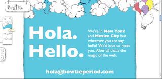
4. Bowtie, period.
This was my favourite site out of all the ones I've blogged about. The art direction is very appealing to me. And the main thing thing that captured my attention was the great navigation. Again, the navigation bar here is fixed. But the little changes are very cool. For instance, in the left panel, the colour of the section coincides with the little navigation picture; and there is a mascot of some sort in the right panel who changes his attire accordingly. Very trippy design. Really like it.
Labels: assignment post, blog, colours, design, interesting, screenshots, Web Design
Subscribe to:
Post Comments (Atom)


4 comments:
Post a Comment